The First Three Seconds of a Static Ad: Researching Visual Hierarchy Without Copying
Learn to read what a static ad asks the eye to do first, second and third, then write it down as a hierarchy spec your designer can use without tracing anyone else’s layout.
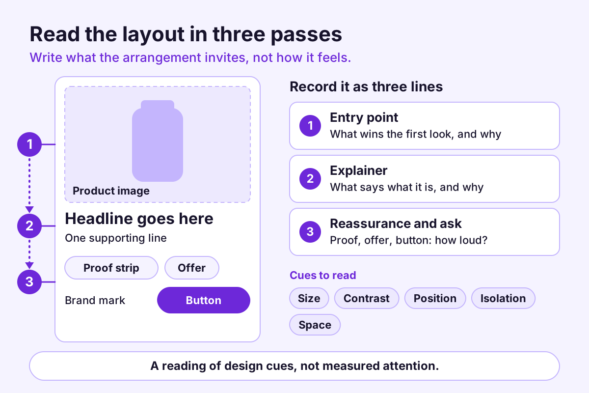
Hold your thumb over the headline of any static ad and look at what remains. Now cover the picture instead. Try it on a handful of ads and you will often find the picture and the words doing different jobs: one wins the first look, the other finishes the argument. That division of labor, meaning which element is asked to do what and in what order, is the ad’s visual hierarchy. It is one of the most useful things you can study in a competitor’s static creative, and one of the easiest to copy by accident.
The “three seconds” in the title is a discipline, not a statistic. Nobody can promise how long a given person looks at a given ad. The frame is there to make you review at feed speed, before you have had time to rationalize the layout, so you write down what the arrangement invites instead of what you already know the ad says.
A hierarchy is an arrangement, not an attention measurement
Visual hierarchy is the order in which a layout invites the eye, built from size, contrast, position, isolation, color and empty space. You can read an invitation from a layout. You cannot read actual attention from it. A public ad record gives you the creative, not eye-tracking data, so everything that follows is interpretation: useful, labeled and open to disagreement.
That label matters later, when you write a brief. “The headline is the entry point” is a reading. Keep it in the interpreted column, next to the observed fact that the headline is the largest element.
Read it in three passes
Do the passes in order, and at a size you would really meet the ad at. Shrink the image to a thumbnail, or step back from the screen. Write one line per pass.
Pass one: the entry point
What do you notice first? Name it as a noun phrase: a product close-up, a bold number, a face, a block of color. Then ask why it won. Is it the largest element, the highest contrast, the only thing with space around it? An entry point that wins on several cues is a confident one. If it wins on none, two elements are probably competing for the first look.
Pass two: the explainer
Once the entry point has you, what tells you what this is and why it matters? Usually a headline, a label or a demonstration inside the image. Check its relationship to the entry point: does it sit close enough to read as one thought, or far enough that the eye has to choose between them?
Pass three: the reassurance and the ask
What is left: proof such as a rating, a specification or a certification, plus the offer, the button and the brand mark. Note where each sits and how loud it is. A price badge louder than the product is a decision. So is a button that is nearly invisible. Neither is automatically wrong, but both belong in your notes.
Write it in words, not in mood
“Clean, premium, modern” cannot be compared or briefed. A small vocabulary can:
- Dominant, supporting, tertiary: the weight ranking of elements.
- Entry point: the first element that wins attention.
- Resting place: the calm area where the eye settles, often empty space.
- Competing focal points: two elements with similar weight and no clear order.
- Grouping: what is tied together by proximity, alignment or a shared container.
- Carrier: whether the message lives in the text, the image or both.
A complete reading fits on one line: “1 Product close-up (dominant, center-left), 2 Headline (supporting, top right, high contrast), 3 Rating strip and price (tertiary, bottom edge).” If you cannot write the line, you have not finished the reading. Store it with the record: the record ID, the observation date, a screenshot marked with numbered circles, and the one-sentence reading. Months later the note still makes sense, and the interpretation can be re-checked against the creative.
A worked example: three layouts, one message (invented)
Imagine three invented ads for a single-cup kettle, all making the same claim: it is small enough for a crowded counter.
| Layout | First | Second | Third | Question it seems to answer |
|---|---|---|---|---|
| A: headline-first | Large headline, top third | Product photo, smaller, lower right | Rating strip | What is this for? |
| B: product-first | Product on a cluttered counter, full bleed | Caption with dimensions | Small price badge | Will it fit my space? |
| C: proof-first | Customer quote in large type | Product thumbnail | Offer line | Do other people like it? |
Same message, three different first impressions. That is the real finding of a hierarchy reading: the order decides which question the ad answers first. It also points to the cleanest test you could build from this research: layouts A and B with the same message, the same photo and the same offer, differing only in what comes first. Which one does better is a question for your own measurement, not for the references.
Each layout is a bet on what the viewer most needs answered first. Headline-first suits a product people may not recognize. Product-first suits a physical-fit hesitation. Proof-first suits a trust hurdle. None is right in general. Your own evidence, such as support questions, reviews and sales-call notes, tells you which question your buyers actually ask first, and that, not the reference, should set your entry point.
Three traps when reading hierarchy
Mistaking loud for important. A gradient, a sticker or a texture can dominate a layout without carrying any of the argument. Ask what the loudest element is for before you call it the entry point.
Reading the template instead of the choice. Plenty of ads share a layout family. The information is in what the advertiser put into each slot, and what it left out.
Reading at desk size. At full size on a large monitor, everything is legible and every element looks deliberate. The feed is small. If the hierarchy only works at poster scale, write that down.
What a layout cannot tell you
- Whether it worked. An arrangement tells you what was attempted. Nothing in a layout reveals results, and an ad that has been running for a long time has not been shown to be profitable by that fact alone.
- Why it was chosen. A hierarchy can come from strategy, from a template, from brand rules or from a production deadline.
- What the audience actually saw. An image in a record may be a different crop or placement from the one a viewer met. When a record has only a thumbnail or missing media, say so before you read its hierarchy; see data coverage.
- What the category’s habits are worth. If six competitors lead with a product close-up, you have learned the category’s habit, not a winning formula.
From reading to brief, without tracing
- Write each reference’s hierarchy as one line, using the vocabulary above.
- Name the question each one seems to answer first.
- Decide which question your ad should answer first, using your own customer evidence, not the references.
- Specify your hierarchy in words and rough boxes: “product about half the frame, headline two lines, price small.” A wireframe made of labeled rectangles has no brand in it, which is the point.
- List what must stay visible, so it survives cropping.
- Choose the single variable.
A fill-in version for the hierarchy field of a brief:
Entry point:       ____ (wins first look through: size / contrast / isolation)
Explainer:         ____
Reassurance:       ____
Ask:               ____
Resting place:     ____
Must stay visible: ____
One rule keeps this honest: no reference goes into the design file. The designer works from the spec and your own assets. If a reference is needed for context, it stays in the research folder, labeled “context, not target.” The static-ad brief template has a visual-hierarchy field and a references field that sit well beside this spec.
A ten-minute team exercise
Gather five or six images at thumbnail size: some of your own drafts, and some references with brand marks hidden. Give everyone the same three-column sheet: the entry point they saw, the question it seemed to ask, and anything that competed with it. Ask each person to fill it in before anyone speaks. Compare. Where people disagree, the layout is ambiguous, and ambiguity is worth fixing before you spend media budget. A handful of colleagues is not a study, so use the exercise to find unclear layouts, not to pick a winner.
Where this fits in a research routine
Static ads reward this kind of reading because the whole argument has to land in one frame. Ad8’s static ad intelligence page covers the idea, and the Static Creative Structure Review described on the creative reports page asks the same question: how does each ad organize what the viewer sees? Whatever tool you use, keep the observation (“the headline is the largest element”) apart from the interpretation (“the ad leads with the explanation”) and from the test you propose. If a tool labels a layout “minimal” or “product-led,” treat that as an interpretation too, and check it against the image before it goes in the observed column; AI-assisted visual labels can be wrong.
Sources and further reading
- Ad8 static ad intelligence: how static ads can be read for message, structure and proof.
- Ad8 creative reports: the research modes and the observation, interpretation and test-hypothesis layers.
- Ad8 static-ad brief template: where the hierarchy spec goes.
- Ad8 data coverage and research limits: what a record can and cannot show, including missing media.
- Meta Ad Library and Meta’s help page About the Meta Ad Library: where public ad records can be browsed. Ad8 is independent of Meta; the links are background reading, not an endorsement of this method.
Turn the next observation into a better question.
See how a source-linked review separates what was observed, what it might mean, and what you could test with your own creative.
Explore the sample report